Interactive Progress View
DocETL can show a full-screen, live progress dashboard in your terminal while a pipeline runs: per-operation cost and timing, per-document status, and the output and prompt of any finished document.
Turning it on
Install the optional tui extra (which pulls in
Textual):
pip install "docetl[tui]"
Then add interactive_ui: true at the top level of your config (next to
default_model):
default_model: gpt-4.1-nano
interactive_ui: true

pipeline:
  steps:
    - name: themes
      input: reviews
      operations:
        - extract_theme
        - canonicalize_themes
        - summarize_themes
  output:
    type: file
    path: output.json
# The interactive dashboard is a CLI feature: it starts when `docetl run`
# finds `interactive_ui: true` in the YAML config. Pipelines executed
# through the Python Frame API (.collect(), .show(), .write_json()) use
# the standard log output instead.
#
# To use the dashboard for a pipeline built in Python, export it to YAML,
# add `interactive_ui: true` at the top level, and run it with the CLI:

pipeline.to_yaml("pipeline.yaml")
# then: docetl run pipeline.yaml
And run the pipeline the usual way:
docetl run pipeline.yaml
The dashboard only starts in an interactive terminal. In a script, a CI job, or anywhere the output is piped, DocETL falls back to its normal log output, so the flag is safe to leave on.
What you see
There are three panels:
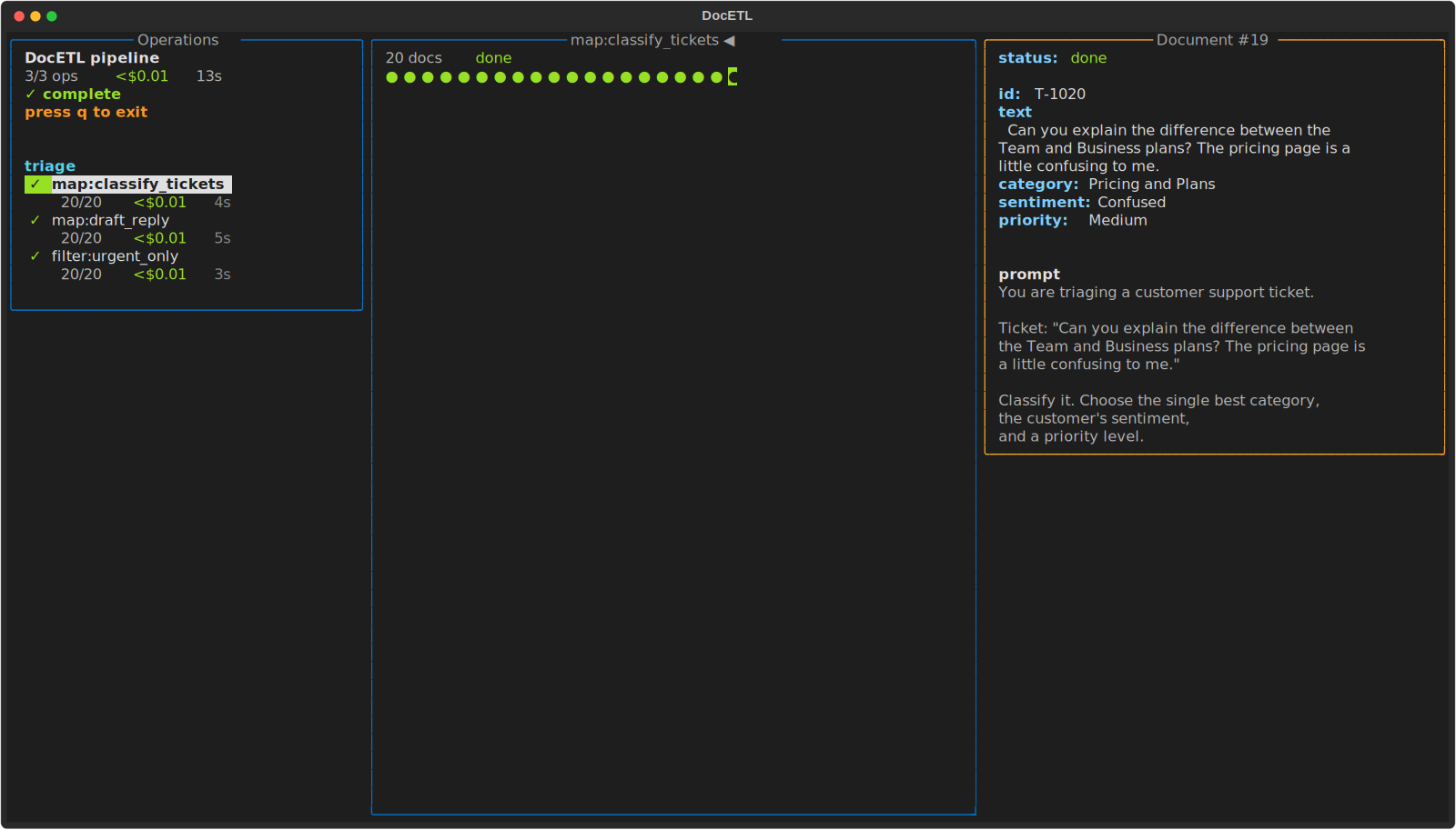
- Left — operations. Every step and operation, with live status, counts, cost, and elapsed time. Total cost and time for the run are at the top.
- Middle — documents. One circle per document for the selected operation. A filled circle is done (green), in progress (orange), or errored (red); a hollow circle has not started. The header shows the operation's progress.
- Right — detail. The output of the document under the cursor, the prompt that produced it, and a note about where it came from. Documents appear here as soon as they finish, while the run is still going.
Moving around
| Key | Action |
|---|---|
↑ / ↓ |
select an operation |
Tab |
switch between the operations list and the document grid |
← / → |
move the cursor in the grid (and page through large grids) |
PgUp / PgDn |
page through the grid |
Enter |
inspect the document under the cursor |
q |
quit (the run keeps going) |
What each kind of operation shows
The progress bar counts the unit of work for each operation, and the detail panel notes where a document came from.
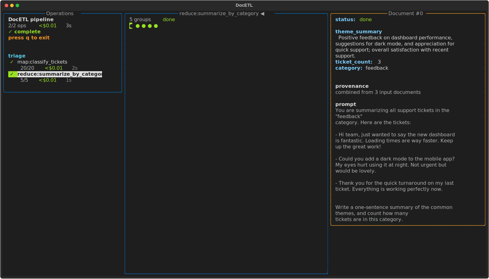
Reduce counts groups, and a group shows how many documents were combined into it:
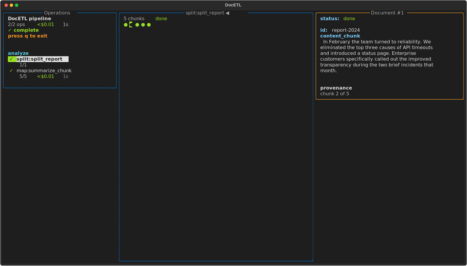
Split counts chunks, and a chunk shows which piece of its source document it is (for example, "chunk 2 of 5"):
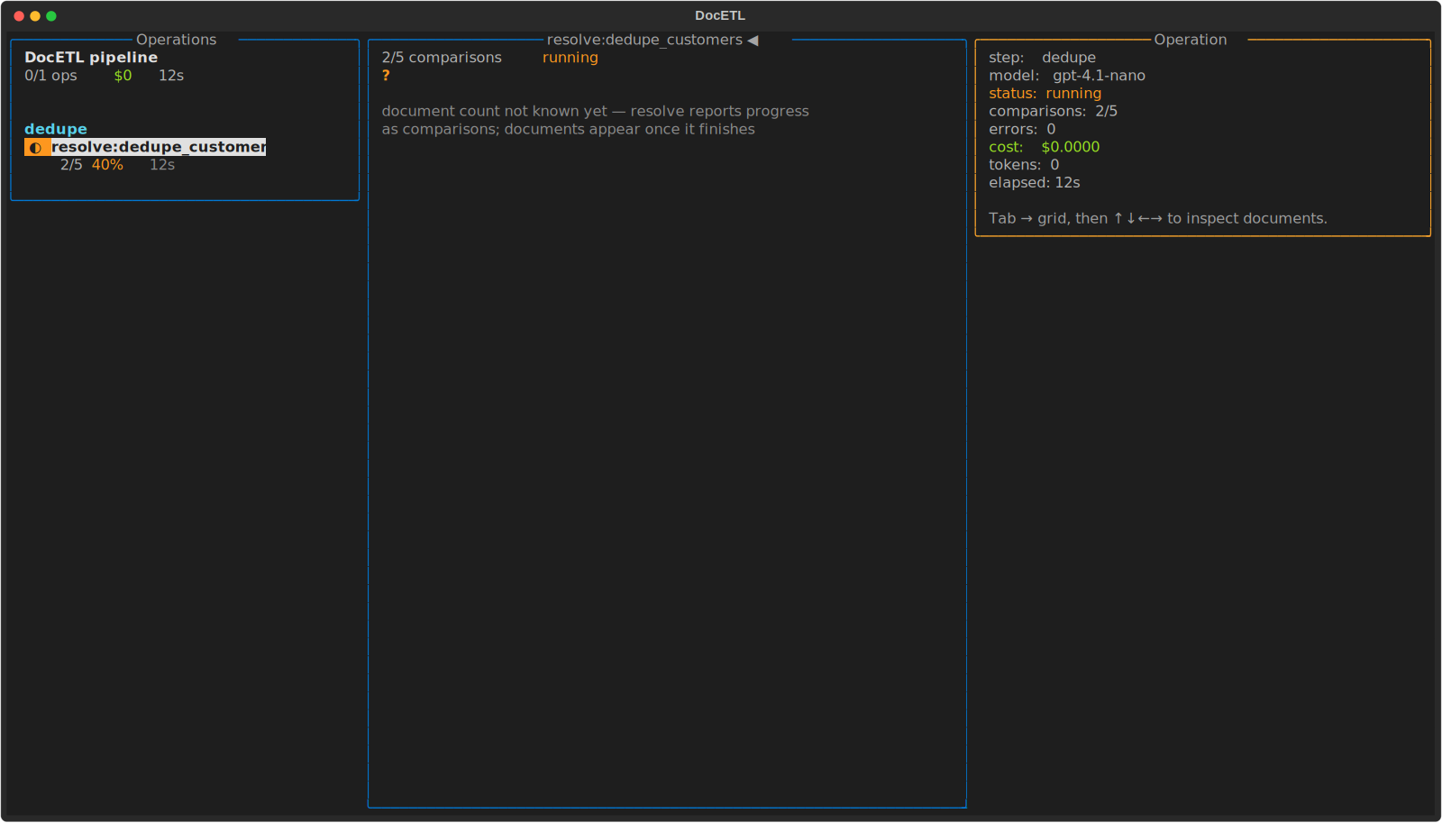
Resolve and equijoin count comparisons as they are made. Their output
documents aren't known until the operation finishes, so while it runs the header
counts comparisons and the grid shows a ?:
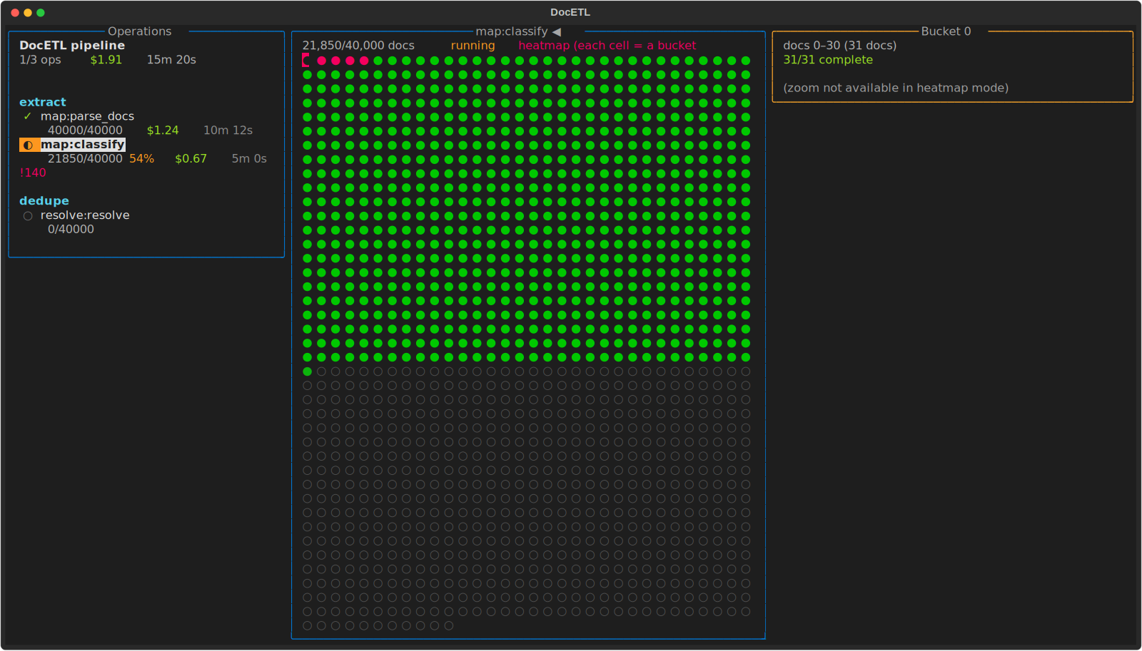
Very large runs
For runs with tens of thousands of documents, the grid switches to a heatmap: each cell stands for a bucket of documents, shaded by how many are done. Live counts and per-operation totals still update.